Skip links

Uptown18 Branding and Logo Design

Defining an Iconic Event Space Identity

Client

Uptown18

Project

Naming and Branding

Nestled in the heart of Jewish Youth Network’s state-of-the-art campus, Uptown18 is an event space that’s about creating moments that linger long after the last toast. When creating their brand, we didn’t simply design a logo or write clever messaging; we built a presence that embodies sophistication, ease, and excellence.

At the heart of Uptown18 lies a simple yet powerful ethos: Gather. Celebrate. Elevate. These Click-crafted words don’t just describe what they do—they define how every Uptown18 event feels. Every brand element was shaped to reflect this vision, from the understated elegance of the logo to the confident, inviting tone that speaks directly to those who host with intention. The name we carefully developed reflects the brand's sophisticated and premium positioning within a competitive market.

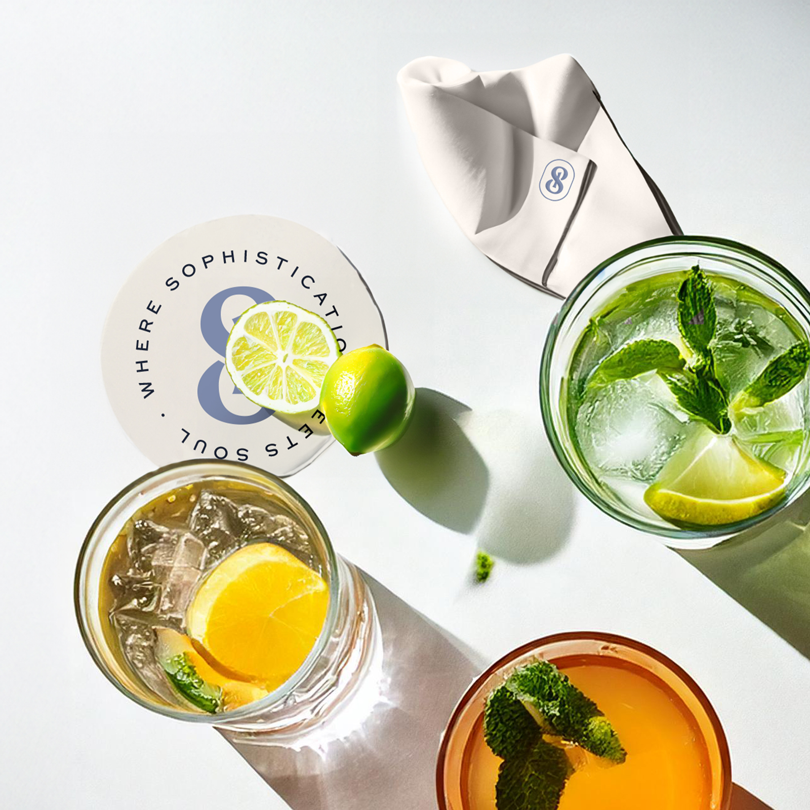
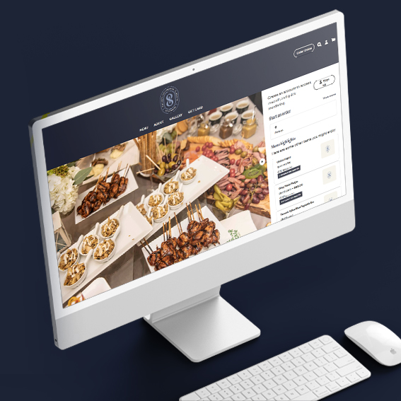
The visual identity—sleek, modern, and undeniably refined—became a signature of effortless luxury. The brand voice was designed to resonate with a discerning clientele: poised but warm, polished yet personal. Uptown18 doesn’t just provide a service; it offers the assurance that every detail will be executed flawlessly, every gathering will be elevated, and every host will shine.

This isn’t about selling a menu or even a service. It’s about crafting a brand that transforms events into experiences and gatherings into legacies. Because at Uptown18, excellence isn’t an option—it’s the standard.